

Consider yourself in a department store in search of fresh work attire. As you explore around, you discover weird odours, jumbled shelves, and stained flooring. Which of these retailers would you shop at if you were to stay?
The layout of a store has a significant impact on how customers behave websites are the same way.
According to a poll by Clutch with 612 people, the majority (83%) appreciate it when a website looks professional and well-designed. As an alternative, if half of the people who visit a website find the information to be irrelevant or unsatisfactory, they will never return.
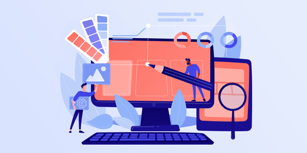
How Then Do You Go About Making A Website That Actually Attracts Visitors?
This entire piece is dedicated to that subject. We will demonstrate the significance of good web design and provide 9 guidelines you may follow to create a professional website.
For What Reasons Is It Crucial To Have A Well-Designed Website?
An annual salary of $57,000 is typical for web designers, almost $8,000 more than the average salary of $44,000 for rookie web engineers. For good reason, designers earn above-average salaries: their contributions are crucial.
The initial impression a potential customer has of your company is formed by their time spent on your website. This is the moment when people form their initial impression of you.
Additionally, your website is a representation of your company’s values, mission, and standing in the market. Even if your product is comparable to others on the market, a website that makes visitors go “wow” will help you stand out from the crowd and increase sales.
Having A Solid Website Also Helps With SEO
When determining a site’s position in search results, search engines take user feedback into account. Search engines will give you a higher ranking than a competitor whose bounce rate is higher if your visitors tend to look at several pages on your site rather than just one.
Here, technical SEO is equally crucial. Titles, page architecture, and links that are clearly organised and labelled make websites easier to use. Consequently, they are favoured by both customers and search engines. It’s time to examine some foundational tenets of good website development.
The 9 Rules of Good Web Design
The term “web design principles” is commonly used to refer to a set of guidelines that should be followed when creating a website or web page. In terms of web design, every company is distinct; some adhere to established standards while others don’t.
Here are fifteen web design principles (along with examples of websites that employ them effectively) to help you create an outstanding website:
Each page must be easily browsed.
According to data compiled by Clutch, 94% of users rank easy site navigation as “the most crucial online element.”
This is, of course, to be expected. For example, if a user types “mobile design” into a search engine and is directed to your site, but cannot discover any relevant content, the user will likely leave your site in favour of one that can.
Always take use of blank areas.
White space, often known as negative space, is the area surrounding the primary elements on a web page.
In the misguided belief that more content will increase reader engagement, some marketers are all too eager to cram every available inch of a webpage. But that often leads to pages that are too much to take in.
And that’s when the concept of blank space comes in handy. Because the absence of colour naturally attracts the attention to brighter places, using negative space is a great way to highlight the most important aspects of each page.
Just because it’s suggested that you “use negative space” doesn’t mean that you have to make a website that’s all white. Use your brand’s colours to make the most of the available area.
Maintain cohesion while keeping readers interested on each page.
Logos, typefaces, and aesthetics associated with brands like Cadbury, Hershey’s, and Nike certainly spring to mind when you read their names. The power of constant brand recognition.
Create a visual identity for your brand through the use of uniform elements across your website. In other words:
- Making sure all headers use the same fonts, colours, and styles
- Maintaining consistent margin sizes across multiple pages
- By relying on predetermined colour schemes, rather than a haphazard assortment of hues,
- Developing standards for the presentation of articles, blogs, and other lengthy works
- Having all of a website’s pages look the same
All of the pages in a consistent document don’t have to look the same. Instead, you can strike a balance between monotony and interest by switching things around a bit.
Headings 1, 2, and 3 (H1, H2, and H3), for instance, can each have their own unique font and colour scheme. Alter the structure of unique page kinds to add variety.
Use colors that contrast one another.
Use complementary colour combinations to avoid your design becoming overpowering or unattractive.
On a computer screen, colours are displayed using the Red, Green, and Blue (RGB) colour model, as opposed to the Cyan, Yellow, and Black (CMYK) model used for printing. The Red-Yellow-Blue (RYB) colour paradigm is also commonly used in painting; it states that red and green, blue and orange, and yellow and purple are complementary hues.
However you may feel about black and white models, the use of complimentary hues serves the same function. Using colours that are complementary to one another is a great way to draw attention to certain elements of your brand’s design.
Using the notion of complimentary colours is a simple way to improve the visual appeal of your work. Select two colours that are opposite one another and use them to accentuate items that are already in contrast. You might also use a variety of different tones of the same hue on each page.
Focus on your market when creating content.
The websites of The Cool Kids, and Swab The World all have their own distinct “feel.” In order to achieve that effect, the website’s layout must be customised for each visitor.
The end goal is to make it as unique as possible. Most people prefer to support businesses with whom they identify and whose values they share. The majority of consumers (72%) said they are more likely to buy from a company if they “match with their ideas and values.” Customers are more likely to make a purchase from you if they visit your website and find themselves reflected in the content.
As you work on the layout of your website, keep the following in mind to better cater to your target demographic:
- Which exact images are most likely to appeal to your target audience?
- Which tones resonate with your target market?
- The specific information that your market expects to see on your site
- Web design strategies for communicating brand positioning
The best places to post calls-to-action (CTAs) to maximise CTR based on how well they perform with your target demographic.
You get extra points if you can tailor the user’s experience on your website to their unique profile and past experiences with your brand through the use of automation tools.
Consider looking to similar businesses or brands that target the same consumers for ideas.
Typefaces should be legible and user-friendly.
To what extent site visitors can read what you’ve written depends on the fonts you’ve chosen to employ. It’s safe to say they play a significant role.
The primary factor in picking a typeface is its compatibility with your website. Web-safe fonts are those that are supported by most browsers and operating systems.
Accessibility is another factor to think about. Typefaces designed to be used in an accessible format should be legible at both large and small sizes. Unlike Times New Roman, which is readily accessible, fonts based on cursive writing are not.
Incorporating this data into your search for a suitable typeface for your website’s content could prove fruitful. You could also opt to do anything else.
It’s important to abide by Fitt’s Law and Hick’s Law.
Fitt’s Law, proposed by psychologist Paul Fitts in 1954, is still widely used today (2022). According to Fitt’s Law, the time required to achieve an objective increases with its size.
Web designers and UX experts know that users will spend less time on smaller buttons and more time on larger ones. Therefore, in accordance with Fitt’s Law, you should make your calls to action (CTAs) very bold and obvious.
The word “easy” is essential. The British psychologist William Edmund Hick and the American psychologist Ray Hyman established a theory called Hick’s Law which states that making a decision exhausts a person.
Therefore, the more options a website user is presented with, the greater the likelihood that they may become too overwhelmed to continue.
Use simple, appealing language in your calls to action.
We discussed how important it is to make your buttons big and easy to click, but that’s not all you need think about when developing buttons.
Buttons that can be clicked on are both informative and enticing. They pique the user’s interest in the destination of the button’s click and encourage them to explore further.
To do this, you can put descriptive content on your buttons, such as “here’s our 2022 report” or “go here to read our blog.” Making your buttons visually interesting or distinctive is still another option.
In today’s digital world, reputable websites prioritise speed and mobile compatibility.
At the end of Q4 2021, mobile devices accounted for 54.4% of all international website traffic. You may lose as much as 50 percent of your website’s audience if it isn’t optimised for mobile devices.
Website load times also affect organic traffic. Google found that if a page takes longer than three seconds to load, 53 percent of users will abandon it.
Choosing a fast website theme created by professional designers is the simplest approach to make your site mobile-friendly or quick. You can also opt to develop your website from scratch using responsive web design tools.
Incorporate grids.
We don’t mean for you to create a website that look like an Excel spreadsheet when we say “use grids.” Instead, make sure each component of your website has a clear purpose so that users can easily navigate and get the information they’re looking for.
Grid lines are unnecessary here. If you want to differentiate grid cells like Atlason did, use colour, negative space, and shading. The newest and best-selling products are grid-arranged on Atlason’s home page. Seeing as how the customers are probably looking for these items, the grids speed up the process of finding them. Choosing a grid-based WordPress theme is a simple method to include grids into your website design.
Summary
Stores can either win back customers or turn them off permanently with their design choices. The same holds true for web development. Creating a website that is both functional and attractive to the eye is not only a hobby. It’s useful because:
- Demonstrate your competence.
- Gain your confidence.
- Differentiate yourself from the pack.
- Increase your site’s visibility in search engines and attract visitors naturally.
Use the advice in this article to create a website that will blow your visitors’ minds.


